Moving Images Brief
Animation has been an interest of mine for years. I have created a couple of stop motion animaitons, and earlier this month I created a GIF from imagery I created in a 'drawing with scissors' workshop. Having this knowledge of some of the basic laws of animation sped up the process of creating a new GIF.
In my previous GIF creation, the images on each frame were too large format, which meant that Photoshop (where the GIF was constructed) worked slowly and struggled to process it. So this time, I kept to around 100pixels per inch, and A5/A6 canvas size.
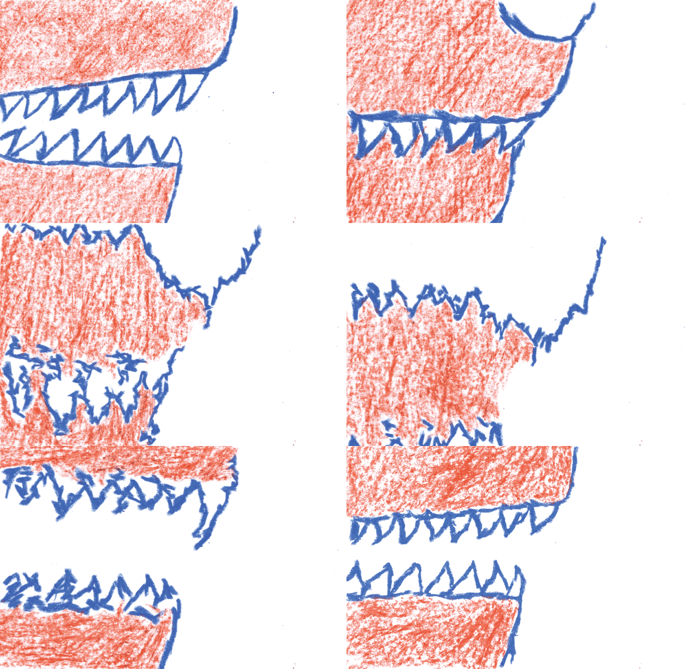
I wanted to create a GIF which looped so the first and last frames are the same, and it looks like a continuous cycle. I had looked into other artists who create GIFs and this was something which I noticed worked well. I homed in on the element of my last GIF I particularly liked (the wolf's nose/mouth as it howls) and used this as a starting point. Creating a very short storyboard by sketching out potential frame designs meant It was easy to see how frames could transition. When I drew the teeth, it reminded me of stalactites and melting wax candles. So I drew the next frames, looking at how it might look if the teeth 'melted' into one another and back to teeth again. A more fluid design. (see storyboard below)

I then went into Photoshop, and used a drawing tablet to roughly sketch out key frames 1, 4, 8 and 12. Looking at my storyboard as a guide, I added the in between frames (using opacity as Photoshop version of 'onion skin' to guide each in between drawing) so that it looked fluid, and joined together.

The black like drawing on photoshop wasn't giving me the textual effects I wanted to show, and I also wanted to utilise some of the drawing experiment skills I've worked on in the last couple of weeks. Mainly the rougher texture created by oil pastels. I printed out each frame on paper, then used Layout paper (as it's see though like tracing paper, but keeps the harsh white tone of paper) and traced the outlines with bright blue oil pastels.

It turned out pretty well, but I still felt like the generic lines on white background weren't really very experimental. So I had a flick through some of the work I'd done recently, and I decided to use the colour combination from the 'Construct / observe / reimagine' brief and the blue and orange chalk 'cityscape' drawing. I drew orange oil pastel lightly over sections of my blue pastel drawings. This added more textural effects and made the gif seem more alive and exciting.
The GIF outcome is a little unnerving because it's hard to differentiate the start/middle/end - which is why this gif works as a more abstract piece.

Out of curiosity, I changed the 'Hue and Saturation' of each frame to see how the colour combination changed the effect of the drawings. The green looks a lot more like slime and melting away than representing teeth. I still prefer the orange and blue because of this.


